Illuminating Engagement: Strategies for Ensuring Eye-Catching Neon Signs
As a professor with a passion for design and visual communication, I am excited to shed light on the art and science of crafting neon signs that captivate the eye and leave a lasting impression. Neon signs have a unique ability to draw attention and create a memorable visual experience. In this article, I will guide you through key strategies to ensure your neon sign stands out and catches the eye, whether it’s for a business storefront, event promotion, or personal expression.
Strategic Placement
The first step in ensuring your neon sign catches the eye is to strategically choose its placement. Consider the surroundings, sightlines, and traffic patterns of the intended location. Placing the sign where it can be easily seen from a distance and from various angles maximizes its visibility. Whether suspended above a storefront, mounted on a wall, or displayed in a window, a well-placed neon sign can instantly command attention.
Contrasting Colors
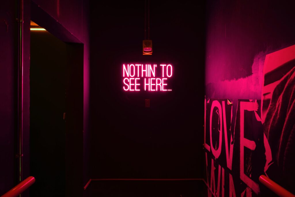
Color plays a crucial role in grabbing attention. Choose colors that create a striking contrast with the background and surrounding environment. Bold color combinations, such as vibrant red against a dark backdrop or neon green against a neutral wall, can make your neon sign pop and become an irresistible focal point. Experiment with color palettes that align with your brand or message while ensuring readability and visibility.
Font Selection and Legibility
The choice of font significantly impacts how easily a neon sign can be read from a distance. Opt for clear, legible fonts that are easy to decipher even in low-light conditions. Avoid overly elaborate or intricate fonts that might compromise readability. Make sure the letters are appropriately spaced and sized to enhance visibility, and consider incorporating a mix of uppercase and lowercase characters for added visual interest.
Animation and Motion
Adding an element of animation or motion to your neon sign can create an instant attraction. Incorporating flashing lights, sequential patterns, or subtle movements can intrigue passersby and encourage them to take a closer look. However, it’s essential to strike a balance; too much animation can be distracting and detract from the overall message.
Unique Design and Shape
An unconventional design or shape can make your neon sign stand out in a sea of visual stimuli. Custom shapes and creative layouts can pique curiosity and make your sign memorable. Think outside the box and consider how the shape of your sign can reinforce your message or brand identity.
Appropriate Size
Size matters when it comes to catching the eye. A neon sign that is too small may go unnoticed, while one that is overly large might overwhelm the viewer. Strike the right balance by choosing a size that fits the intended space and complements the overall aesthetics of the environment.
Integrated Lighting Effects
Incorporate lighting effects that enhance the visual appeal of your neon sign. Halo lighting, backlighting, or additional accent lights can create a multidimensional look that adds depth and complexity to your sign. These effects not only catch the eye but also add an element of sophistication and artistry.
Conclusion
Crafting a neon sign that catches the eye requires a thoughtful combination of design principles, strategic placement, and creative flair. By considering factors such as contrast, legibility, animation, unique design, and integrated lighting effects, you can create a neon masterpiece that commands attention and engages viewers on a visual journey. Remember, the goal is to create a harmonious blend of aesthetics and functionality that leaves a lasting imprint in the minds of all who encounter your eye-catching neon creation.